Sunday, June 24, 2012

Ideas... Jack Chen - The Slow Web


Timely not real-time. Rhythm not random. Moderation not excess. Knowledge not information. These are a few of the many characteristics of the Slow Web. It’s not so much a checklist as a feeling, one of being at greater ease with the web-enabled products and services in our lives.

Like Slow Food, Slow Web is concerned as much with production as it is with consumption. We as individuals can always set our own guidelines and curb the effect of the Fast Web, but as I hope I’ve illustrated, there are a number of considerations the creators of web-connected products can make to help us along. And maybe the Slow Web isn’t quite a movement yet. Maybe it’s still simmering. But I do think there is something distinctly different about the feeling that some of these products impart on their users, and that feeling manifests from the intent of their makers.../
Jack Chen - The Slow Web

Well worth reading Chen's full article... it gave me food for thought.

Tx

Scanned... old covers of 'Starblazer'


Does anyone remember 'Starblazer'?

According to Wikipedia... Starblazer - Space Fiction Adventure in Pictures was a British small-format comics anthology in black and white published by D. C. Thomson & Co. Ltd. from April 1971 to January 1991.

I found a bundle up the loft recently... and thought I'd share them. The artwork isn't brilliant by any means... but they do represent a period of my childhood... the period where I discovered sci-fi and dreamed dreams of space exploration.


According to Wikipedia... "Partway through its run, from issue 168 onwards, the anthology changed format. Instead of a single front cover and a black and white subject on the back, a new all-colour 'wrap around' cover was instituted, most of the time showing a collage of subjects from that issue's storyline. The subject matters also appeared to have a more adult emphasis and there was a heavier focus on Fantasy storylines. The cover title also changed format slightly to Starblazer - Fantasy Fiction in Pictures, despite the title change, there were still a considerable number of Science Fiction storylines up till the final issue."


"The Starblazer issues suffered from poor distribution, being rare in parts of Scotland and almost unknown in the rest of the United Kingdom. Due to a downturn in the general comic market, many newsagents never stocked them, or later would only take subscriptions. This contrasts sharply with the Commando comics from the same publisher that have enjoyed countrywide widespread distribution since their origin in the 1960s."

For more on Starblazer, head of to britishcomics.

Tx

http://en.wikipedia.org/wiki/Starblazer

Saturday, June 23, 2012

Scanned... our 15th Wedding Anniversary 'cards'


To celebrate our 15th Wedding Anniversary... I actually bought Olly two cards (the lassie at WHSmith's must have thought I was a polygamist or something). One with some beautiful typography (above) and one with a sweet graphic from Quentin Blake (below).

I have a thing for ampersands and the type card's ampersand really spoke to me... whereas I've been a longstanding fan of Quentin Blake's illustrations since I picked up some Roald Dahl books as a child. I thought they worked nicely together.


In return... Olly got me this:


Olly bought me a current edition copy of The Hobbit and wrote her anniversary wishes in the inside. As you can imagine... I loved it... and really appreciated the sentiment.

I hope this is the start of a new tradition for us... afterall, books aren't that much dearer than cards these days and will last far longer.

Tx

Some thoughts on simple design


I think it was Merlin Mann who coined the phrase “appropriatism” and then it was Frank Chimero who caught the idea and ran with it... the central precept is this:

“Add things until it starts sucking, take things away until it stops getting better.”

I've spoken about my appreciation of Appropriatism before and this is kind of a follow-on from those thoughts.

For our 15 year wedding anniversary, Olly and I exchanged watches... we had read somewhere that “clock” was the gift that symbolised 15 years of wedded bliss and Olly was in desparate need of a suitable timepiece after the interchangable watches we’d all bought had all died on her. Olly chose a sweet metal-band Lorus or Sekonda number... and I picked the Casio F-91W digital watch... the cheap, plastic one allegedly favoured by terrorists. (It's a terror-wristwatch!!!)
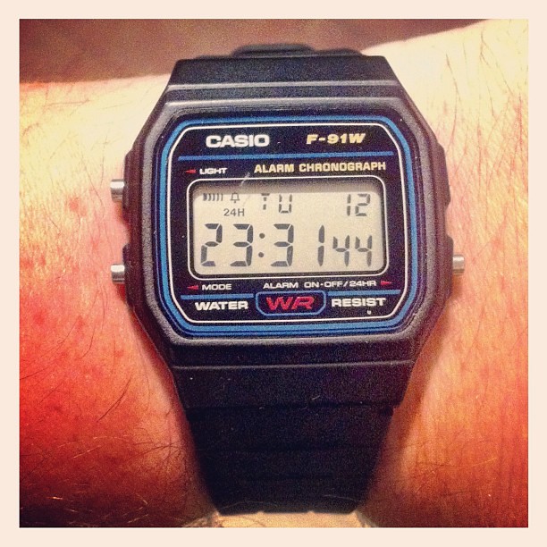
120612_ F-91W

Why did I pick the F-91W? I wanted it for three reasons...

(1) I wanted a metaphor for something cheap that was now priceless to me... an item that demonstrated the transformational power of the gift.

(2) I really like the simple design... it's as if Casio have heeded the principle of “adding things until it starts sucking, and taking things away until it stops getting better.”
In essence, it does exactly what I need and nothing more... I like that. I also like the idea that it hasn't really changed in 20 years... and is still cheap.

(3) It is cheap. £10 in Argos. Cheaper on Amazon or eBay. It's like an anti-status symbol. I have my steel g-shock that Olly got me for my Christmas in 2001... I love it and have only had to change its battery once in 10 years. That’s my status symbol... the F-91W is not.

Since getting the watch for these reasons... I have been pondering the power of simple design.

In many ways... design has this association with the new or the different... a new or different (or both) way of solving a problem. Design, for me, is about intention... it is about seeking to solve a problem presented... it is not just about “fashion” design albeit they do solve the problem of our nakedness... some more elegantly than others.

I guess that’s the point... some solutions are more elegant than others. I consider the F-91W to be an elegant solution... it is not a pretty solution by any means but it is elegant because it solves my problem effectively in a very efficient manner. It is a simple and appropriate design... and has lasted the test of time as a result.


When I think of simple and appropriate design... I think of the F-91W. I also think of the iPod (the classic model) and the Bic biro pen. I think of Converse All-Star lows (preferably in black or white)... or Levi’s iconic 501s (albeit the 501 has changed in years since its initial introduction and there have been multiple iterations since). I also look to The Moleskine Cahier or a Penguin paperback.

Timeless designs... dull and overlooked by some... treasured by others.

It's not a change thing... I am not adverse to change... far from it. It's more about celebrating the products that have gotten their designs “just right”. They aren't about “more” and they aren't about “less”... they are like Goldilocks... they are about “just right”.

Whilst we should never stop thinking about improvements... sometimes we should take a step back and acknowledge when we’ve got it “just right”.

The thing is, however... we are usually too close and need the time to see this.

Look around you and think about everything you consider to be “just right”. Pretty much everything that is “just right” has time on it’s side:

The jeans I am wearing (Levi’s 581s with the cinch buckle) are 17 years old. I got them before I was married... wore them then gave them away to my dad when I went through my cheeseburger-Elvis phase. He kindly returned them a few months ago as I returned to a point where I could wear them again. They are a 32” waist. And whilst I wouldn't consider them to be a simple design (thanks to the cinch) I do think they are “just right”... especially with all the extra fading and scuffing that my dad’s wear provided. They have become “just right” through time.

Worn in... acclimatised...part of... these are all descriptions that could be applied to something you consider to be “just right”... although not solely to simple design. Some designs have unintentional quirks that we get used to... that, in some way, evolve into valuable characteristics that we wouldn't dream of removing. This takes time.

Simple designs have time on their side... they have either lasted... ridden out the ups and downs of fashion... or they have been designed to last. It's almost as if they have been intentionally created not to be noticed. I think the best designs are the ones we don't necessarily notice... designs that just work.

Coming back to the F-91W... it is just right and it just works for me... and I appreciate these considerations. It's not at all about making do... but accepting it is all I need. This is the crux of simple design for me... the realisation and the acceptance that it is all I need to do the job at hand... nothing more, nothing less.

Tx
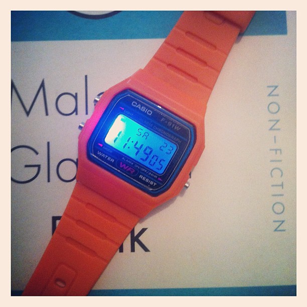
230612_ 'disco light' Casio F-91W

PS: I bought a second F-91W this week... it has an orange strap and ’disco lights’ when I press the light button. I don't think it's a ’proper’ Casio but for £4, I'm not complaining too much. It's fun.

Thursday, June 21, 2012

15 years married

010612_ Olly no3

Today is my 15 year Wedding Anniversary... and I just wanted to say 'thanks' to my dear Olly. She's my rock... my best friend and my dearest partner on this journey we call life.

She gets better and better... and I am so happy she's in my life.

Thanks honey for our life together!

Tx

060412_ Olly n02

060412_ Olly n01

050511_ Olly

010111_ Olly #2


180910_ Olly #2

051109_ Olly_ 03

Olly (171/365)


110211_ Olly playing Slayer


Sunday, June 17, 2012

What I am reading today...


Graphics: A Century of Poster and Advertising Design 

In the words of Bob Marley... "in this great future, you can't forget your past."

It's an interesting wee pocket book that discusses the history of poster design... it's an easy and informative read. Spent some time with it yesterday in my local library.


Editing by Design: For Designers, Art Directors and Editors by Jan V. White

Not sure how I came about this book but it really appeals to me... the blurb on Amazon caught my attention:

"This completely updated edition of an industry classic shows a new generation of editors and designers how to make their publications sing! Readers will find a treasury of practical tips for helping story and design reinforce each other and create powerful pages that are irresistible to readers. Brimming with hundreds of illustrations, Editing by Design presents proven solutions to such design issues as columns and grids, margins, spacing, captions, covers and color, type, page symmetry, and much more. A must-have resource for designers, writers, and art directors looking to give their work visual flair and a competitive edge!"


Lastly... a wee cheeky Father's Day gift from my daughters... which I love and have enjoyed dipping into in my humble attempt to try to improve myself. It's now at home in my DJ bag and I look forward to referring to it for both work and play.

Tx

I like this :: Octofeed.com


Thanks to coolhunting.com for the heads-up to this wonderful re-presentation of Facebook's news feed.

Husband and wife team of Daniel ChinYee and Puno Dostres have re-envisioned the feed... taking the clutter and noise away... and, in doing so, making it truly beautiful.

According to their about...

"It started as a project to learn how the Graph API works and now the experiment is growing up (awkward teenager phase, maybe?).
I love it... albeit I was worried about 'my data'... they reassure you on their 'about' too:

"Sign in and we'll fetch your Facebook feed data, then reformat it in your browser. Don't worry, we don't post to your feed and we won't share any of your personal information with 3rd parties. We don't even store your data on our servers."
It's well worth a wee look... and, if you are fortunate enough to have an iPad, it looks awesome on the iPad.

Check it out.

Tx

http://octofeed.com/http://www.facebook.com/Octofeed


Saturday, June 16, 2012

Loving... this tee for The Narrows by Tom Langfield


I really like this tee from The Narrows... it features the strong visual identity that Tom Langfield created for them along with some nice 2D graphics of instruments and Tower Bridge. I'm a fan of 2D product graphics and the ones Langfield has created for this tee are fab.

It's available on their bigcartel page :: http://thenarrows.bigcartel.com/ :: for a tenner.

With unique designs this strong... it's very easy to support independent music... at least it is for me. I think this is another way indies can differentiate themselves from the mainstream... by featuring great designs from innovative, up-and-coming artists.

Tx

Loving... 'The Eve Of Invasion' by The Narrows


I am forever indebted to the person... whose name I unfortunately can’t remember... that retweeted about The Narrows’ new album ’the Eve of Invasion’. Not only did they turn me on to the wonderful artwork of Tom Langfield (see previous post)... they also turned me on to some seriously wonderful and utterly delightful tunes.

The Narrows are a band from Manchester who playing a deliciously unique form of progressive (small ’p’) electro rock music that effortlessly blends guitars... both chunky and wailing electric, and subtle acoustic... with future-proof synths and expressive electronics... intelligent and vibrant lyrics... and a tremendously powerful rhythm section.

At times I think ’Muse’... at other times I think Yoshi-era ’Flaming Lips’... and again sometimes I think ’Radiohead’ but not one of these comparisons fully get the overall power and oooomph of this album. It is what it is... and delightfully so.

This is an album that warrants repeated listens... it's not something you get all of in one sitting... it needs to infuse within you... to grow and become part of you. There is too much to take in... so much going on in each track... theirs is the kind of dense sonic variety that I love in Radiohead... and don't tend to hear too often... but heartily welcome whenever I can.

It would be wrong for me to go through each track individually... because I would prefer you discovered these tracks for yourself... in a time and place most appropriate for you - they work for me on my headphones, on my hi-fi and in my car - but that's me... find time for this album and see for yourself.

I would also recommend you read the lyrics... some seriously special wordplay going on in these tracks ... a wordplay that is a delight due to it’s expressiveness and lack of overt explanation. The songs made me think and I welcome that. Take this line from ’we invent enemies’... which is possibly the stand-out track for me:

“did no one listen to Eisenhower about the disastrous use of misplaced power?”

Wow!

The Narrows are the full package... great music with intelligent lyrics... deep, varied and engaging. I would love to see/hear them live... I think they'd be brilliant in a mid-size venue.

All in... ’the Eve of Invasion’ is a tremendous album that will with no doubt be on my iPhone for a considerable period of time to come. I've embedded the Bandcamp player below to let you have a wee listen.

Tx

Thursday, June 14, 2012

Loving... the Johnny Cash Project


I'm a big fan of Johnny Cash's music... and it kind of surprises me to think I only found out about The Johnny Cash Project last week.


According to their 'about' section...

"The Johnny Cash Project is a global collective art project, and we would love for you to participate. Through this website, we invite you to share your vision of Johnny Cash, as he lives on in your mind’s eye. Working with a single image as a template, and using a custom drawing tool, you’ll create a unique and personal portrait of Johnny. Your work will then be combined with art from participants around the world, and integrated into a collective whole: a music video for "Ain’t No Grave", rising from a sea of one-of-a-kind portraits.

Strung together and played in sequence over the song, the portraits will create a moving, ever evolving homage to this beloved musical icon. What’s more, as new people discover and contribute to the project, this living portrait will continue to transform and grow, so it’s virtually never the same video twice."
And moving this video is. It's truly wonderful... poignant and emotional... it fits very nicely with the song itself... which is, by pure happenstance, one of my favourite Cash songs.


Some pictures are surreal... and others are very imaginative.


Look out for Jesus and the Loch Ness Monster.


All in... it's a fab video from a commendable project. Watch this video for more:


Enjoy...

Tx

LinkWithin

Related Posts with Thumbnails