
Yesterday... when I went for a coffee and a game of Yahtzee with @myopicaardvark... I noticed the new Starbucks logo had arrived in Glasgow.
Personally, I really like it. Its familiar yet new and fresh... exactly what a design revamp should be, in my opinion.
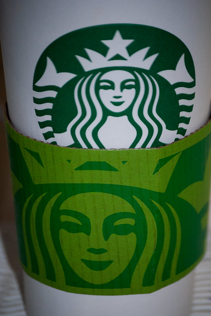
I also like the way the Siren's image is being used on the sleeve... in its enlarged and slightly abstracted glory. Its like the logo is precious... but not something to be slavishly revered... instead there is room for innovative manipulation.
All in... a revamp I really like... so much so I asked for a paper cup to take home. I figured after all the coffees I've had in my own to-go cups... one paper cup wouldn't hurt.
Tx
2 comments:
As I understand it they have removed the word coffee so that they can diversify their business. Talk of beer & ice-cream
I've heard the beer bit... but not the ice cream.
Its crazy to think you can look at it... and even though it doesn't "explicitly" say Starbucks... you know its Starbucks.
Impressed.
Tx
Post a Comment